So, what makes a good photographic composition? It’s best to teach composition as an exercise. It will help you to see a potential photo differently. You should never follow the “rules” without thinking. Use your knowledge of composition to shape your photos into something more meaningful. Understanding compositional techniques are vital to getting the result you want. You can decide if you want to please the eye, evoke a feeling of harmony, or raise a question. If you master photography composition, you can visualize a good photograph without a camera. But what are the rules of composition in photography? Read on to find out! [ExpertPhotography is supported by readers. Product links on ExpertPhotography are referral links. If you use one of these and buy something, we make a little bit of money. Need more info? See how it all works here.]
Rule of Thirds Photo Composition
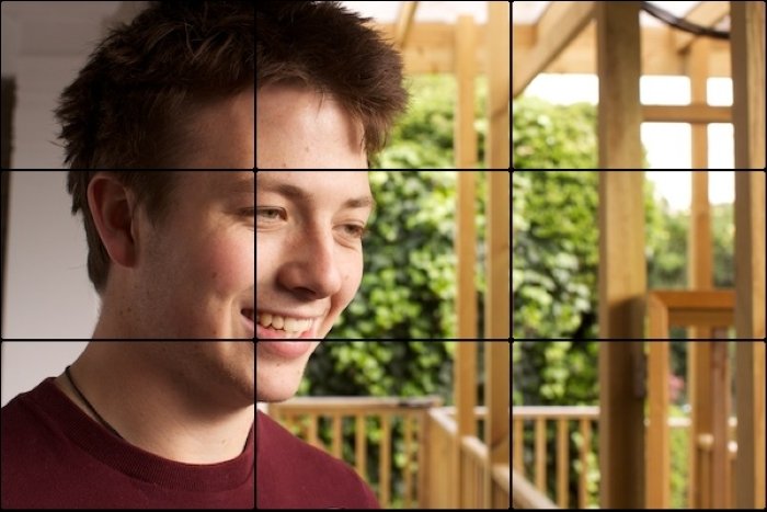
The rule of thirds is the first compositional rule that a photographer comes across. And for good reason—it’s simple, and it works. The basic idea is to divide your camera’s frame into horizontal or vertical thirds. This leaves you with nine equal rectangles and four points of intersection. You should place the main subject or points of interest at these points. Place key objects along these lines to make your photograph more visually pleasing. For example, place the horizon on a horizontal line in a landscape. Place the main subject or key elements, such as eyes, on the point of intersection for a portrait. In the image below, the face is on the left vertical line. And the eye is on the point of intersection.
The photo composition encourages them to explore the photo themselves. This makes the photograph much more interesting. You can even use the rule of thirds in post-processing. While cropping a photo, use the rule so that the subject falls on one of the points of intersection. This method will also prevent the eye from moving to distracting backgrounds. The rule of thirds is an excellent starting point for getting to grips with composition.
Visual Weight
Visual weight refers to the visual impact a compositional element has. Some elements have a stronger presence than others. It’s up to you how you want to place and balance the various elements in the frame. You can determine the visual weight of an object by many factors. The most obvious is size. The larger the object, the stronger the presence it will have. You can also characterize visual weight by texture, color, tone, depth of field, light, and more. How you place elements according to these aspects can change your photo composition. For example, using bright colors with a white background grabs the viewer’s attention. Placing the main subject in the middle of the frame evokes a strong sense of balance in the image. But if you place the subject towards the side, it can add more interest to the picture. With an understanding of visual weight, you will gain insight into how people look at photos. This will help you establish the composition to direct the viewers’ attention. It’s not so much a tool or rule but an understanding.
Balance
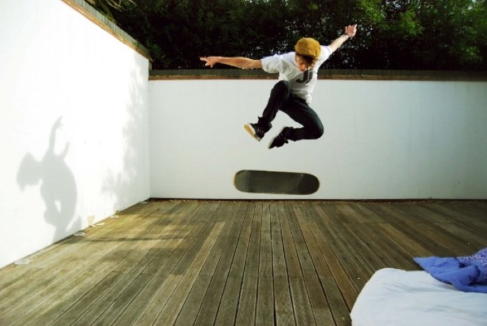
A significant component of the visual weight is balance. Balance in a photo affects how you feel when looking at it. An unbalanced picture can make us feel uneasy. A balanced photo makes us feel more relaxed. You can create balance in a scene in many ways. A simple method is to create symmetry. You can balance your photo composition by playing with differently sized objects. A helpful technique to understand how to create balance is keeping in mind an actual scale with weights. In reality, if two masses are equal, there will be balance. But if there are two different weights, you would place a lighter object further out. As with other composition techniques, there are no rules for balance. Sometimes photographers disrupt the balance in a scene on purpose. This technique grabs the viewer’s attention for longer. It also generates a feeling of unresolved tension. You can also unbalance a scene to direct the viewer’s eye toward a particular element. In the image below, the subject is off-center. The smaller shadow in the negative space at the edge of the photo counterbalances it.
Whether you choose to make the scene balanced or unbalanced doesn’t matter. But, you should understand why you’ve decided to do so and have reasons to justify this choice. The more you know, the easier it will be to produce the desired effect.
Triangles
Triangles exist in almost everything we see in one way or another. The important thing is to distinguish and know what to do with them. Triangles make great compositional tools as they’re easy to find and manipulate. Triangles play a crucial role in guiding the eye around the scene. The best thing about triangles is their ability to make a photo feel stable or unstable. Using triangles as a photo composition technique doesn’t have to be noticeable. You don’t have to have three clear joining lines to produce a defined triangular shape. Most triangles in photography are implied. The photo below, for example, only has one physical line. But, the shape of the roof and the angle of the building’s sides form a triangle.
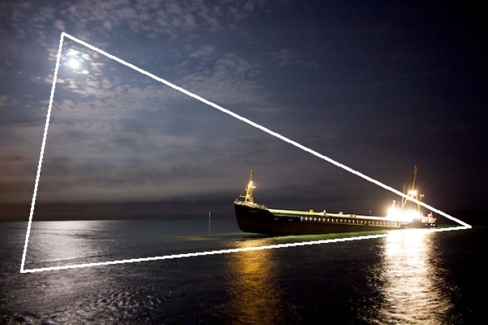
All triangles have converging lines, but it is not a rule that they must converge in the frame. For example, when shooting buildings, they might converge at the top, out of the frame. Also, photographers don’t always frame triangles upright. Some photos will be unstable, where the photographer places the triangle at a weird angle. At times, it can be upside down. This immediately draws attention to the picture because it’s different. Sometimes triangles don’t even need a single line. Three-figure shots are images with three main subjects of equal visual weight in the frame. These subjects also produce a triangle as the viewer’s eye moves to each subject for the same amount of time. The majority of your photos will have three distinguished points of interest. It’s a case of identifying and linking them in a way that makes sense. In the image below, the ship, the moon, and the moon’s reflection create a triangle.
Eye Lines
If you take photos of people, you’re using eye lines. An eye line is the implied line that follows a person’s line of sight. Understanding the effect these lines have on how we view photos is essential. When we talk to people, it is natural to look at their eyes. We are first drawn to the eyes, even in an image. After looking at the subject’s eyes, we follow the subject’s gaze. This helps us relate to the subject more. An eye line can have many effects, depending on where the main subject looks. The eyes are the most expressive part of the human body. So, having the subject look straight into the lens can produce an intense effect. Although eye lines are not real lines, they can produce different elements. An eye line can imply a vertical line or be part of a triangle. The great thing about using an eye line as one of the lines is that you can choose where you want the triangle to start. An eye line is a great photo composition tool to guide the viewer’s eye. This line can create a linear motion between two subjects looking at each other. It can also guide the viewer’s eye to an otherwise unnoticed element in the frame. When our eyes look all over the frame in a scene, we tend to observe the image for longer. We’re trying to decide what everyone is finding so important. All of these lines have different directions. This introduces an element of dynamic tension that makes the image more intriguing.
Single Point
One of the most basic forms of composition in photography is single point. This is where there is only one point of interest in a scene. As this is quite a common occurrence, it pays to know what to do with it. You should understand what a single point can do to a photo. There is much more to it than meets the eye. A single point can provide interest in an otherwise dull photo composition. It is usually quite small and contrasts with the rest of the image. You can place it in the middle of the frame or off to the side. See the image below. Placing the subject in the middle of the image will bring a strong sense of balance.
If you follow the rule of thirds when placing your single point, the photo will be much more dynamic. A scene doesn’t need any points of interest to be successful, though. Have a look at the most expensive photo in the world as an example.
Horizons
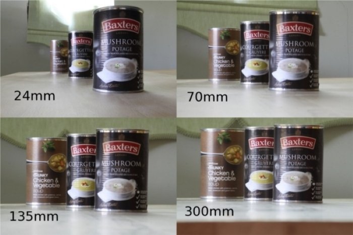
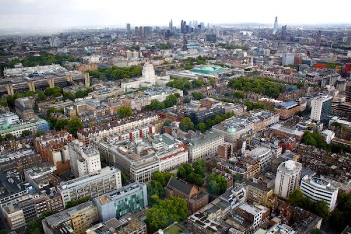
Horizontal lines play a significant role in photography composition. When a single, dominant line divides a frame, the line is usually a horizon. This is common in outdoor photography, particularly in landscapes. A horizontal line generates a strong sense of stability because of the relation to the ground we stand on. If the rest of the photo is empty, this line becomes a dominant part of the scene. This is due to how it separates the frame. Exactly where you place the horizon can have a considerable effect on the image. Which part of the scene is the most significant? And how do you want to make your viewer feel about the divide? There are many ways to use a horizontal line to enhance the photo composition. One way to add a straight horizontal line to an image is by using perspective. A photo of many objects from far with a long focal length can create a straight line. You can see this in the image below.
Sometimes if you change your angle of view, you can find a strong horizontal line. In this way, a viewpoint is like perspective. You can see a clear horizon if you increase your height, like in the photo below. But if you were taking a picture from ground level, such a strong horizontal line may not appear.
Another technique for producing a horizontal line is contrast. In the image below, the contrast produced by ripples creates many horizontal lines.
Contrast can be between light and dark, big and small, and bright and dull elements.
Frame Within a Frame
Frames are a great photographic element that you can use to lead the viewer’s eyes into the scene. They focus attention on a particular point. Frames provide a sense of repetition, depth, and a path for the eyes to explore. A frame in the foreground creates a build-up in the central part of a scene. In some cases, it can carry equal weight to the rest of the scene. You can also place the frame in the background and your main subject in the foreground. Look at this photo composition below.
Not all frames have to surround the whole subject. Half frames can lead the viewer’s eye toward a specific part of the image. Using frames in your image is a great way to add depth. You can do this by using a shallow depth of field or repetition. Another way is to place objects of the same height at different distances from the camera. This makes the object further away look smaller.
If the frame is particularly eye-catching, don’t neglect it. Make the frame an equal part of the photo like in the image below. Here the frame adds a sense of location.
Other points to remember when using frames in your image are exposure and creating paths.
Dynamic Tension
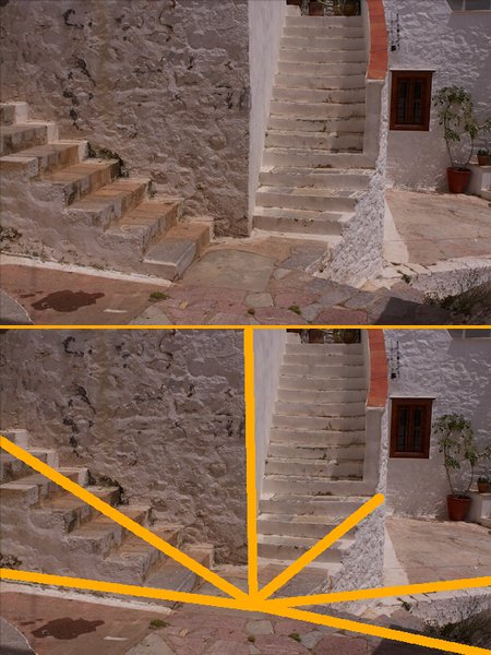
One of the most exciting techniques in photography composition is dynamic tension. Dynamic tension is a way of using the energy and movement available in the frame. It draws the viewer’s eyes out of the scene in different directions. We’ve already looked at different lines that you can use in a photo. Dynamic tension takes these lines and adds varying degrees of contrast between them. The photo composition below demonstrates dynamic tension in the simplest and most obvious way. The leading lines move outwards from the center of the picture to the edges.
These are a few easy ways to spot dynamic tension:
Many diagonal lines moving away from each other in different directions Paths that move in an opposing direction Body language that contrasts between 2 or more subjects
You can identify a feeling of tension when viewing the photo composition below.
Many contrasting directions produce a strong sense of the photo pulling itself apart. The strongest dynamic tension comes from the widest angles. You can even add points of interest at the end of each path to draw the viewer in opposite directions. Body language is one of my favorite things to capture. Negative body language is a great natural source of dynamic tension. The notion is that people move away from things they don’t like. This creates contrasting positioning and looks.
Framing & Rotation
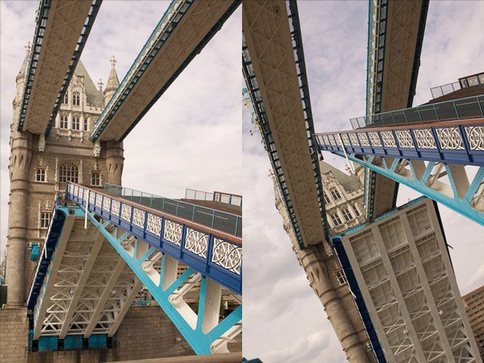
How you frame your image is also vital. For example, the tower and the ground in the left image provide stability and balance. In the photo composition on the right, the ground looks tilted, and each line of the bridge continues out of the image. This adds to the dynamic tension. The angle between the bridge’s parts on the right is bigger than on the left. This also increases the tension. The image on the right carries most of its visual weight at the top, making it unbalanced. The exaggerated length of the top section of the bridge on the right makes the shot more dramatic.
To add even more tension to an image, try rotating it. This trick can produce an abstract photograph with a lot of tension. In the picture below, the rotation resulted in creating a vertical element. This element contrasts well with the rest of the image.
Dynamic tension is where composition can start to get a little more advanced. But it tends to lead to more exciting photography. Take the knowledge you’ve already learned and use it to create photos with more depth. Pro Tip: As a rule of thumb, don’t use dynamic tension in every image for a single portfolio. While dynamic tension produces a big difference, overusing it has a negative effect.
Depth
Depth is a fundamental photo composition technique. It guides the viewer’s eye into the scene and makes it come to life. When we take a photo, we turn a 3D image into 2D. This can cause problems when trying to show the depth of a scene. This has advantages and disadvantages depending on what you try to convey. But in the end, it holds you back when trying to add depth to a scene. Leading lines, converging lines, and the rule of thirds are only a few ways to create a sense of depth in a scene. Another technique that photographers use is to include foreground interest in the frame. A diagonal line leads your eye toward the distance, creating a sense of depth. In the photo below, the line draws your eye to the background.
Vertical elements are an effective way of creating a sense of depth. Take two or more “vertical” objects you know to be of similar height. Place one further away than the other. The more distant vertical line appears smaller, providing a sense of depth. For example, the trees in the photo composition below start to appear shorter.
You can also use a wider field of view. Place your subject far from your camera to generate a strong sense of depth.
Conclusion
Understanding composition is essential to improving your photography. Photo composition is about the relationship between the main subject and other elements. There are many techniques to enhance the composition of your image. These include leading lines, the rule of thirds, and many more. To decide on your composition, determine what will grab the viewer’s attention. Figure out where you want to draw the viewer’s eye. Then use the composition techniques discussed to frame those elements in the camera.


title: “A Beginner S Guide To Basic Photo Composition” ShowToc: true date: “2023-01-14” author: “James Clarke”
So, what makes a good photographic composition? It’s best to teach composition as an exercise. It will help you to see a potential photo differently. You should never follow the “rules” without thinking. Use your knowledge of composition to shape your photos into something more meaningful. Understanding compositional techniques are vital to getting the result you want. You can decide if you want to please the eye, evoke a feeling of harmony, or raise a question. If you master photography composition, you can visualize a good photograph without a camera. But what are the rules of composition in photography? Read on to find out! [ExpertPhotography is supported by readers. Product links on ExpertPhotography are referral links. If you use one of these and buy something, we make a little bit of money. Need more info? See how it all works here.]
Rule of Thirds Photo Composition
The rule of thirds is the first compositional rule that a photographer comes across. And for good reason—it’s simple, and it works. The basic idea is to divide your camera’s frame into horizontal or vertical thirds. This leaves you with nine equal rectangles and four points of intersection. You should place the main subject or points of interest at these points. Place key objects along these lines to make your photograph more visually pleasing. For example, place the horizon on a horizontal line in a landscape. Place the main subject or key elements, such as eyes, on the point of intersection for a portrait. In the image below, the face is on the left vertical line. And the eye is on the point of intersection.
The photo composition encourages them to explore the photo themselves. This makes the photograph much more interesting. You can even use the rule of thirds in post-processing. While cropping a photo, use the rule so that the subject falls on one of the points of intersection. This method will also prevent the eye from moving to distracting backgrounds. The rule of thirds is an excellent starting point for getting to grips with composition.
Visual Weight
Visual weight refers to the visual impact a compositional element has. Some elements have a stronger presence than others. It’s up to you how you want to place and balance the various elements in the frame. You can determine the visual weight of an object by many factors. The most obvious is size. The larger the object, the stronger the presence it will have. You can also characterize visual weight by texture, color, tone, depth of field, light, and more. How you place elements according to these aspects can change your photo composition. For example, using bright colors with a white background grabs the viewer’s attention. Placing the main subject in the middle of the frame evokes a strong sense of balance in the image. But if you place the subject towards the side, it can add more interest to the picture. With an understanding of visual weight, you will gain insight into how people look at photos. This will help you establish the composition to direct the viewers’ attention. It’s not so much a tool or rule but an understanding.
Balance
A significant component of the visual weight is balance. Balance in a photo affects how you feel when looking at it. An unbalanced picture can make us feel uneasy. A balanced photo makes us feel more relaxed. You can create balance in a scene in many ways. A simple method is to create symmetry. You can balance your photo composition by playing with differently sized objects. A helpful technique to understand how to create balance is keeping in mind an actual scale with weights. In reality, if two masses are equal, there will be balance. But if there are two different weights, you would place a lighter object further out. As with other composition techniques, there are no rules for balance. Sometimes photographers disrupt the balance in a scene on purpose. This technique grabs the viewer’s attention for longer. It also generates a feeling of unresolved tension. You can also unbalance a scene to direct the viewer’s eye toward a particular element. In the image below, the subject is off-center. The smaller shadow in the negative space at the edge of the photo counterbalances it.
Whether you choose to make the scene balanced or unbalanced doesn’t matter. But, you should understand why you’ve decided to do so and have reasons to justify this choice. The more you know, the easier it will be to produce the desired effect.
Triangles
Triangles exist in almost everything we see in one way or another. The important thing is to distinguish and know what to do with them. Triangles make great compositional tools as they’re easy to find and manipulate. Triangles play a crucial role in guiding the eye around the scene. The best thing about triangles is their ability to make a photo feel stable or unstable. Using triangles as a photo composition technique doesn’t have to be noticeable. You don’t have to have three clear joining lines to produce a defined triangular shape. Most triangles in photography are implied. The photo below, for example, only has one physical line. But, the shape of the roof and the angle of the building’s sides form a triangle.
All triangles have converging lines, but it is not a rule that they must converge in the frame. For example, when shooting buildings, they might converge at the top, out of the frame. Also, photographers don’t always frame triangles upright. Some photos will be unstable, where the photographer places the triangle at a weird angle. At times, it can be upside down. This immediately draws attention to the picture because it’s different. Sometimes triangles don’t even need a single line. Three-figure shots are images with three main subjects of equal visual weight in the frame. These subjects also produce a triangle as the viewer’s eye moves to each subject for the same amount of time. The majority of your photos will have three distinguished points of interest. It’s a case of identifying and linking them in a way that makes sense. In the image below, the ship, the moon, and the moon’s reflection create a triangle.
Eye Lines
If you take photos of people, you’re using eye lines. An eye line is the implied line that follows a person’s line of sight. Understanding the effect these lines have on how we view photos is essential. When we talk to people, it is natural to look at their eyes. We are first drawn to the eyes, even in an image. After looking at the subject’s eyes, we follow the subject’s gaze. This helps us relate to the subject more. An eye line can have many effects, depending on where the main subject looks. The eyes are the most expressive part of the human body. So, having the subject look straight into the lens can produce an intense effect. Although eye lines are not real lines, they can produce different elements. An eye line can imply a vertical line or be part of a triangle. The great thing about using an eye line as one of the lines is that you can choose where you want the triangle to start. An eye line is a great photo composition tool to guide the viewer’s eye. This line can create a linear motion between two subjects looking at each other. It can also guide the viewer’s eye to an otherwise unnoticed element in the frame. When our eyes look all over the frame in a scene, we tend to observe the image for longer. We’re trying to decide what everyone is finding so important. All of these lines have different directions. This introduces an element of dynamic tension that makes the image more intriguing.
Single Point
One of the most basic forms of composition in photography is single point. This is where there is only one point of interest in a scene. As this is quite a common occurrence, it pays to know what to do with it. You should understand what a single point can do to a photo. There is much more to it than meets the eye. A single point can provide interest in an otherwise dull photo composition. It is usually quite small and contrasts with the rest of the image. You can place it in the middle of the frame or off to the side. See the image below. Placing the subject in the middle of the image will bring a strong sense of balance.
If you follow the rule of thirds when placing your single point, the photo will be much more dynamic. A scene doesn’t need any points of interest to be successful, though. Have a look at the most expensive photo in the world as an example.
Horizons
Horizontal lines play a significant role in photography composition. When a single, dominant line divides a frame, the line is usually a horizon. This is common in outdoor photography, particularly in landscapes. A horizontal line generates a strong sense of stability because of the relation to the ground we stand on. If the rest of the photo is empty, this line becomes a dominant part of the scene. This is due to how it separates the frame. Exactly where you place the horizon can have a considerable effect on the image. Which part of the scene is the most significant? And how do you want to make your viewer feel about the divide? There are many ways to use a horizontal line to enhance the photo composition. One way to add a straight horizontal line to an image is by using perspective. A photo of many objects from far with a long focal length can create a straight line. You can see this in the image below.
Sometimes if you change your angle of view, you can find a strong horizontal line. In this way, a viewpoint is like perspective. You can see a clear horizon if you increase your height, like in the photo below. But if you were taking a picture from ground level, such a strong horizontal line may not appear.
Another technique for producing a horizontal line is contrast. In the image below, the contrast produced by ripples creates many horizontal lines.
Contrast can be between light and dark, big and small, and bright and dull elements.
Frame Within a Frame
Frames are a great photographic element that you can use to lead the viewer’s eyes into the scene. They focus attention on a particular point. Frames provide a sense of repetition, depth, and a path for the eyes to explore. A frame in the foreground creates a build-up in the central part of a scene. In some cases, it can carry equal weight to the rest of the scene. You can also place the frame in the background and your main subject in the foreground. Look at this photo composition below.
Not all frames have to surround the whole subject. Half frames can lead the viewer’s eye toward a specific part of the image. Using frames in your image is a great way to add depth. You can do this by using a shallow depth of field or repetition. Another way is to place objects of the same height at different distances from the camera. This makes the object further away look smaller.
If the frame is particularly eye-catching, don’t neglect it. Make the frame an equal part of the photo like in the image below. Here the frame adds a sense of location.
Other points to remember when using frames in your image are exposure and creating paths.
Dynamic Tension
One of the most exciting techniques in photography composition is dynamic tension. Dynamic tension is a way of using the energy and movement available in the frame. It draws the viewer’s eyes out of the scene in different directions. We’ve already looked at different lines that you can use in a photo. Dynamic tension takes these lines and adds varying degrees of contrast between them. The photo composition below demonstrates dynamic tension in the simplest and most obvious way. The leading lines move outwards from the center of the picture to the edges.
These are a few easy ways to spot dynamic tension:
Many diagonal lines moving away from each other in different directions Paths that move in an opposing direction Body language that contrasts between 2 or more subjects
You can identify a feeling of tension when viewing the photo composition below.
Many contrasting directions produce a strong sense of the photo pulling itself apart. The strongest dynamic tension comes from the widest angles. You can even add points of interest at the end of each path to draw the viewer in opposite directions. Body language is one of my favorite things to capture. Negative body language is a great natural source of dynamic tension. The notion is that people move away from things they don’t like. This creates contrasting positioning and looks.
Framing & Rotation
How you frame your image is also vital. For example, the tower and the ground in the left image provide stability and balance. In the photo composition on the right, the ground looks tilted, and each line of the bridge continues out of the image. This adds to the dynamic tension. The angle between the bridge’s parts on the right is bigger than on the left. This also increases the tension. The image on the right carries most of its visual weight at the top, making it unbalanced. The exaggerated length of the top section of the bridge on the right makes the shot more dramatic.
To add even more tension to an image, try rotating it. This trick can produce an abstract photograph with a lot of tension. In the picture below, the rotation resulted in creating a vertical element. This element contrasts well with the rest of the image.
Dynamic tension is where composition can start to get a little more advanced. But it tends to lead to more exciting photography. Take the knowledge you’ve already learned and use it to create photos with more depth. Pro Tip: As a rule of thumb, don’t use dynamic tension in every image for a single portfolio. While dynamic tension produces a big difference, overusing it has a negative effect.
Depth
Depth is a fundamental photo composition technique. It guides the viewer’s eye into the scene and makes it come to life. When we take a photo, we turn a 3D image into 2D. This can cause problems when trying to show the depth of a scene. This has advantages and disadvantages depending on what you try to convey. But in the end, it holds you back when trying to add depth to a scene. Leading lines, converging lines, and the rule of thirds are only a few ways to create a sense of depth in a scene. Another technique that photographers use is to include foreground interest in the frame. A diagonal line leads your eye toward the distance, creating a sense of depth. In the photo below, the line draws your eye to the background.
Vertical elements are an effective way of creating a sense of depth. Take two or more “vertical” objects you know to be of similar height. Place one further away than the other. The more distant vertical line appears smaller, providing a sense of depth. For example, the trees in the photo composition below start to appear shorter.
You can also use a wider field of view. Place your subject far from your camera to generate a strong sense of depth.
Conclusion
Understanding composition is essential to improving your photography. Photo composition is about the relationship between the main subject and other elements. There are many techniques to enhance the composition of your image. These include leading lines, the rule of thirds, and many more. To decide on your composition, determine what will grab the viewer’s attention. Figure out where you want to draw the viewer’s eye. Then use the composition techniques discussed to frame those elements in the camera.


