What You Need for Editing Street Photography in Lightroom
To be able to follow this tutorial you will need:
Lightroom – I will be using Lightroom 6, but for this specific tutorial, it doesn’t really matter which version you use because all of them have the controls we are going to be using. Tablet -From my point of view a tablet is really handy while editing photos, but it is not a must. You can follow this tutorial and do everything just with your mouse. A photo to edit – Ideally the photo is yours but if not feel free to take one from the internet. The reason I’m saying it should be yours is a raw image with values that have not be clamped is better for following this tutorial. A photo shot in raw will allow you to have more control over shadows and highlights. If you don’t have one though, a photo from the internet will still work.
Step by Step Instructions
To edit a photo and give it that urban look we have two possibilities:
Why Would You Use a Preset?
Sometimes when you are editing you want to apply the same color correction to a bunch of photos at the same time. In this case a preset is pretty useful. Presets can be made or downloaded, either for free or paid. If you are new to installing or creating them, check out our tutorial where we go into more detail. But in this article we are going to start from scratch, and I definitely recommend you give it a try when you have the time. Throughout this article I’m going to take you step by step through the basic techniques and color corrections that I use, and feel free to use them or to try your own. For the sake of keeping it short I’m going to do a photo in color. I believe doing street photography editing in color is always more complex than doing it for black and white. But if you want to know how to achieve that look after reading this article, here’s a tutorial on editing black and white photography in Lightroom. For this article, I wanted to list all the steps we are going to follow, and these will be:
Composition White Balance Exposure and contrast Highlights and shadows Presence Tone Curve HSL Split Toning Sharpening Effects
Let’s get into it!
Composition
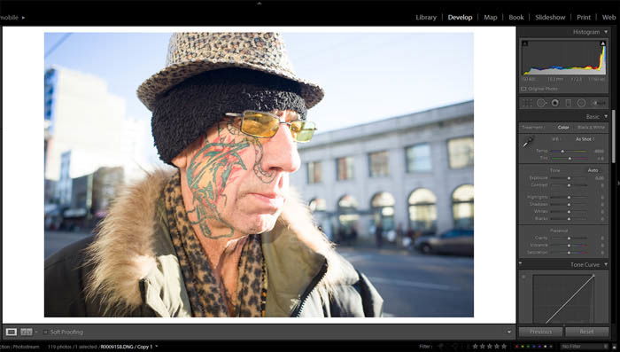
First of all, I am going to grab the raw image I’ll be using so we can all start from the same place: All my sliders are reset and there’s no color correction done at all. The first thing I like to do when I start with a photo is study the composition of the image. As you can see in this case we have a middle aged man standing in the middle of the frame wearing really uncommon clothes a great pair of sunglasses. He also has a tattoo that goes along his face and neck. When I was taking the photo I knew that I wanted to show his tattoo and his glasses so I made sure these two items were in the middle of the frame. and those are the ones that we are going to try to make really vivid. This will draw the viewer’s attention to them even more. In this case, I’m liking what we have and I don’t think we need to rotate it or crop it, so for now, we will leave it as is.
White Balance (WB)
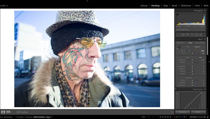
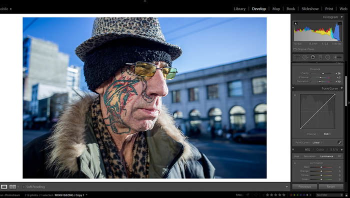
Every time I have to work with a photo one of the very first things I will do is make sure the white balance is right. As you can see the photo above was really warm. To get more cold tones in the photo, I moved the temperature slider to the left towards the blue zone to get more of those. As I was doing that, I realised that the photo was a bit pink so I adjusted the slider towards greens as well.
Exposure and contrast
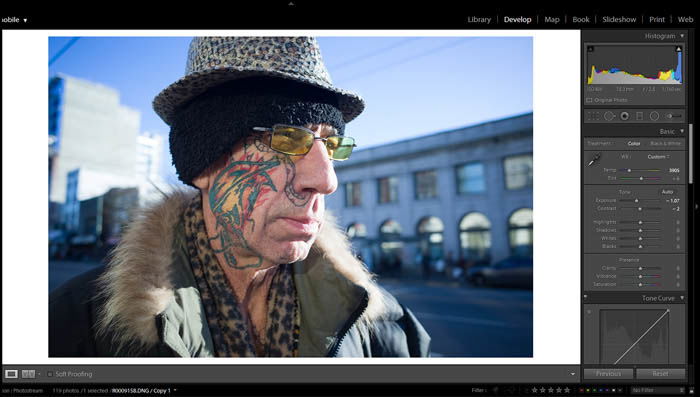
Always try to get your photo in range, that’s the most valuable advice I can give you. In this case, the photo was a bit overexposed so what I’m going to try to do is to bring it down a bit. As you can see in the photo below we have decreased the exposure and the contrast a bit in order to see more of the details and bring back some of the highlights that were overexposed.
Highlights and shadows
This is the part where things start to get interesting and where we are going to start adding that urban editing look that we are looking for. In this step, we will be working with the highlights, shadows, whites and blacks to get a more appealing image with more contrast. First, we are going to take the highlights almost all the way down (-81). The reason behind this is that we want to get back some of the blue tones in the sky, and those belong to the highlights. Second, we are going to bring up the shadows (+39). We are doing this to be able to see some details in the shadows so we don’t lose them while contrasting the image. Try not to go too far with it, you don’t want to end up with a really bad looking HDR image. Third, we are going to pull down the white a tiny bit (-2) so we make the image a bit darker. Fourth and last step, black levels. This last step is one of the most important ones to achieve the high contrast look we want. By taking them down (-43), we are going to get more volume. If you raise the black levels, you’ll get a flatter image.
Presence
Inside this menu we have three variables: clarity (which is going to make our image softer or sharper), Vibrance (which is going to determine if our colors are going to be vivid or not) and saturation (which as you can assume is going to make our photo pop more or if we go to the other extreme, make it black and white). In our case, we are boosting up the clarity to make the image more high contrast and sharper (+26), turning down the vibrancy a tiny bit (-2) and turning down the saturation overall (-10). The reason why we are turning down the saturation is that we want to be specific about the tones that will pop out. In our case red (tattoo) and yellow (glasses).
Tone Curve
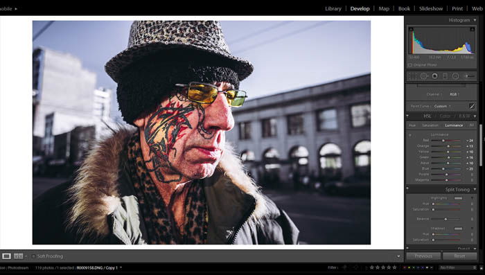
The curve tool is a must if you want to know what’s really going on with your photo and where the values you are processing are. This is co-related with the Histogram (Top Screen Right Side). By clicking on the curve we will add new points. Now that you know this let’s get into it and continue editing our photo. The first thing I’m going to do is give it that flat (or very Instagram-like) look that most of film photos used to have. To achieve that we are going to raise the lower end of the curve between a 10 and a 15%. Doing this mans that the blacks won’t be as deep anymore. We will do the same in all the three channels as we find it convenient. What we are basically doing by adding points and moving them up and down is to tell the program that we want this tones to be darker than they are and this other values to be brighter than they are to achieve more contrast. The curve from left to right indicates the shadows and the highlights.
HSL (Hue Saturation and Luminance)
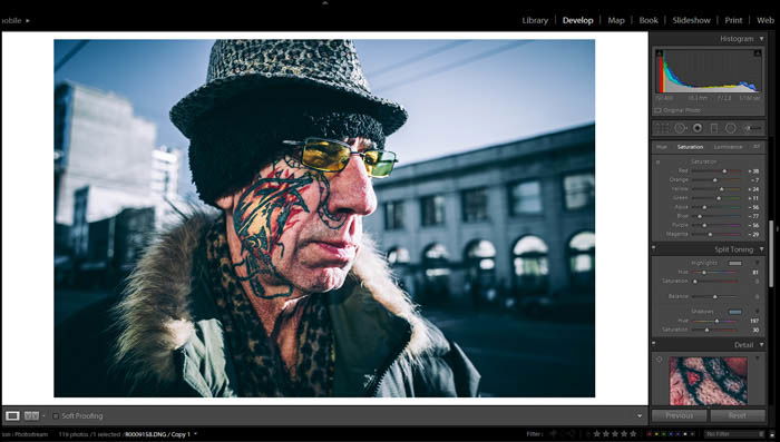
I like to use this menu because it’s the one that allows me to see everything at once. As we discussed before we are going to try to boost up yellows and reds so let’s see how to do it. First, let’s look at this image below where we can see all the values that have been changed. Hue: We are going to make the reds more orange and the greens a bit more yellow. We want to really differentiate between the cold and warm tones in the photo. Saturation: This step is the most important one out of the three. Here we are going to determine what’s important and what not. As you can see our sky is almost gone (blues out). This is going to help us to establish a foreground (the man) and a background (the city). Luminance: Since our model’s face doesn’t have a lot of range in colors, we are going to try to make the different parts of the face to be a bit more noticeable. To do this we are going to boost up the orange since that’s the color that is the most predominant in the face. We’re also going to boost the yellows and greens since those are the ones in the glasses. And the last step is going to be taking down the blues to separate the hat from the sky even more. Below you can see the result after all these color corrections.
Split Toning
Without any doubt one of my favourite tools. It allows us to color correct the highlights and the shadows, and for my particular style of photography I always try to add a red or green tint to the shadows. If there’s a lot of red in the image I will tint the shadows green and the other way around. Here is the photo with these changes applied.
Sharpening
I’m actually not the biggest fan of sharpening images but I must admit that it does make a big difference sometimes. It’s especially relevant when you are thinking of posting the photo to Instagram or any other social networks that you might have. For this image, I set the amount to 75.
Effects
To focus more attention on the subject we will add a bit of vignetting (-14) and a bit of grain to make it more attractive. The style that we are going for is trying to simulate Portra 400 (film).
One Last Step
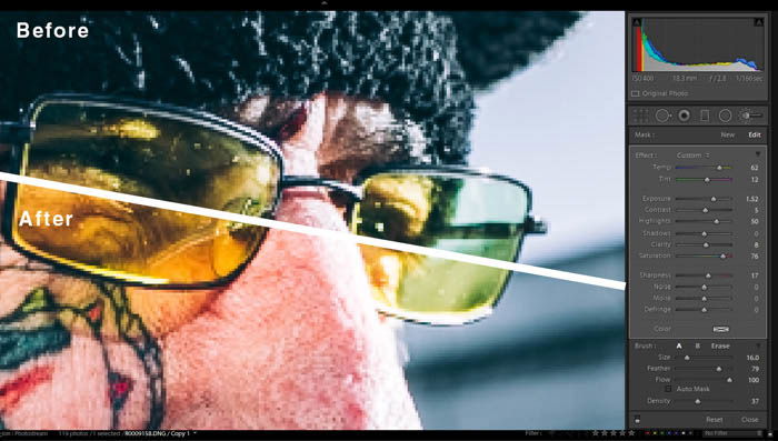
The last step consists of a small color correction by masking the glasses. In the image below, you have the picture before and after the color correction. You’ll want to make color corrections like these to accentuate certain details from the photo that you consider important.
Conclusion
As I’ve shown you in this article, doing a bit of work with Lightroom editing can make your photos more attractive and help differentiate them from others. I do believe that as a photographer you should strive to capture a picture as well as possible straight from the camera. But sometimes editing will help you take it to the next level. Remember that if you don’t feel confident enough to edit your photos there’s always presets you can download, but I encourage you to give it a try anyway. You will be amazed by how simple it is to give your photos that urban look.

