In this article, I’ll explain what triadic colors are and how to use them.
Triadic Colors: What Is Color Theory?
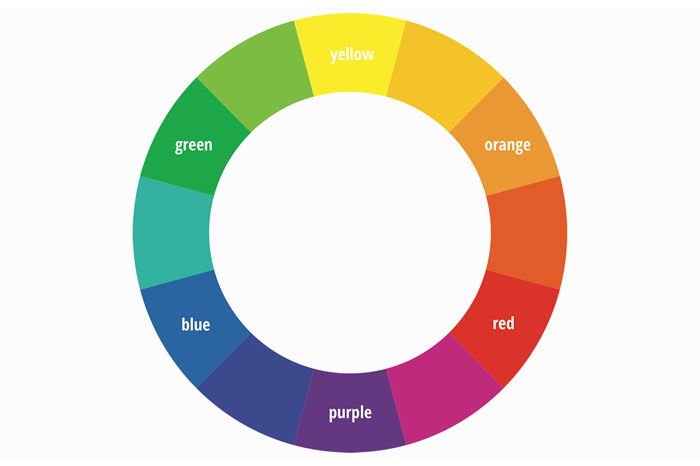
Color theory is a collection of rules and guidelines. It describes the use of color in art and design and it was developed a long time ago. Artists, designers, and photographers still use it today because it works. It all starts with the famous color wheel that shows the relationship between colors. From there, it’s easy to learn about analogous and triadic colors. Even knowing the basics will improve your photography.
You should already know about composition, lighting, and exposure. Add color theory to your photographic tool kit and you’ll make better photos.
What Are Triadic Colors?
Just like analogous colors, triadic colors are easily identified using the color wheel. A triadic color scheme uses three colors that are evenly spaced around the color wheel. For example, the three primary colors form a triadic color scheme: red, yellow, and blue. A triadic color scheme uses every fourth color, leaving three colors between each. You can use all three colors in a photo but also a combination of two will work. The difficult part is to find them when photographing.
Why Use Triadic Colors
Analogous colors make a photo look soothing and calming but triadic colors look uplifting and vibrant. They create more contrast in your photos but still look pleasing to the eye. A triadic color scheme looks harmonious and balanced if you know how to use it in your photos. And even though triadic colors look more uplifting and vibrant, they won’t draw away attention from the subject in your photo. It’s a great way to pull the viewer in.
How to Use Triadic Colors in Photography
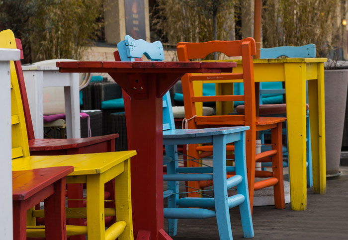
To use a triadic color scheme properly, the colors should be in careful balance. One color is dominant, while the other two colors support. Balance is something you should create in every photo and the best way to learn is by practicing and looking at the work of famous photographers. While it’s easy to find analogous colors in nature, it’s not the case for triadic colors. It’s possible to find them in nature but you have to pay attention to details. It’s easier to find triadic color schemes in the man-made world. Because designers, architects, and other artists also use triadic colors, they’re easier to spot in architecture or painted objects for example. That’s why you’ll see triadic color schemes a lot in street photography. The best way to start is to pick a triadic color scheme, memorize it and head out to the street. Start by looking for two colors and then step up to three.
Make Triadic Colors Work With Your Composition and Lighting
Using a triadic color scheme will help you but it’s not a magical solution to make great photos. Photography is about composition, lighting, and vision. You have to learn to combine everything you’ve learned and only then you’ll be able to make great photographs. So, even if you find a triadic color scheme, it’s up to you to place every element in the frame. The goal is to find balance.
Conclusion
Finding a triadic color scheme is more challenging than finding analogous colors. That also means it’s very rewarding when you do find a scene with perfectly balanced triadic colors. Learning how the color wheel and the basics of color theory work, will definitely make you a better photographer. Use these color schemes to your advantage but don’t forget about your own creativity. They’re just guidelines and shouldn’t be used all the time without thinking.


